A1: Data Visualization
A1: Data Visualization
A1: Data Visualization
Date
June 21, 2024
Tags
Research, Data Wrangling, Data Visualization

Write Up
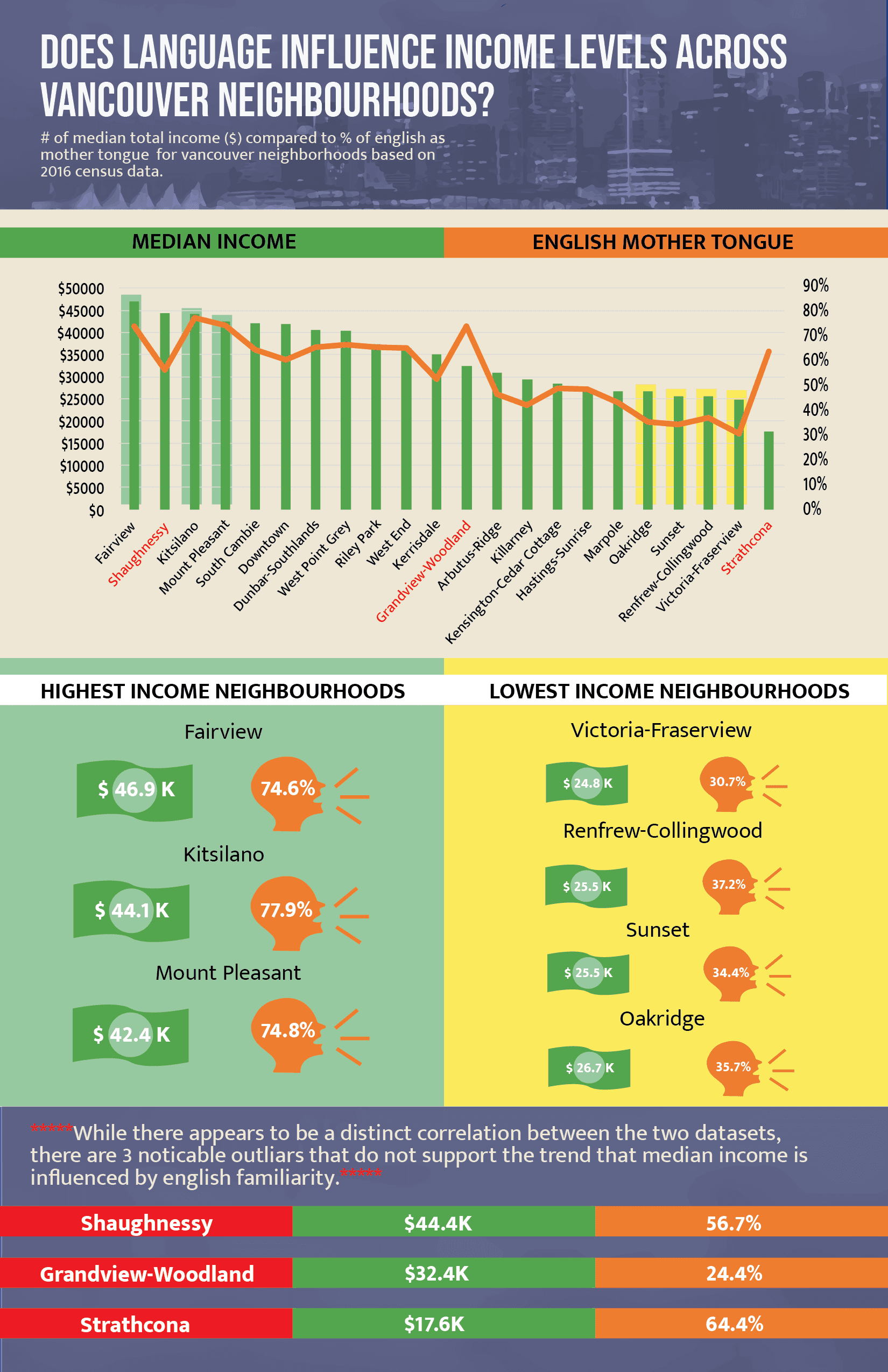
My project was conducted to explore the relationship between Canadians who grew up speaking English with English as a mother tongue and the median income across neighborhoods in Vancouver. The extensive project has yielded some interesting insights and I believe raised thought-provoking questions about language, income, and social equity in the city of Vancouver.
The first step of my process involved hours of research, data wrangling, ideation, testing, and rethinking. When I finally decided on two sets of data which I derived from a master dataset (Vancouver Census Local Area Profiles 2016), my work involved carefully selecting and visualizing the data that I wanted to represent. This involved reordering, comparing, and analyzing the data sets in multiple different forms and with many kinds of graphs.
Process
For the map box portion of the project, I used color opacity to represent income levels across the Vancouver neighbourhoods (darker green for higher income) and varied the size of flags to show the percentage of English speakers (bigger flag for a higher percentage of English as a mother tongue). I also got rid of all map box-generated geographical elements to showcase my data in a simple and understandable manner. The geographic perspective generated from my map offers important visual insights into the correlation of my two chosen datasets which helped me form ideas for my infographic.
As a designer and critical thinker, my journey into exploring this topic began with a personal revelation sparked by conversations with my roommate. Engaged in political debates fueled by misinformation from TikTok and Instagram, I witnessed firsthand the alarming trend of my generation relying solely on social media for news and political discourse. Reflecting on the implications of this, I embarked on a mission to showcase the importance of reputable news sources and the dangers of misinformation on social media.
Drawing from research of scholarly articles, government websites, and population studies, I uncovered startling statistics that confirmed my initial thoughts. It was evident that the majority of millennials and Gen Z-ers prefer social media platforms over traditional news outlets. Moreover, the fact that fake news spreads faster and wider than the truth poses a significant threat to societal cohesion and informed decision-making.
With a clear understanding of my video's purpose, I set out to craft a compelling narrative that would resonate with my chosen audience—primarily Canadians and members of my generation who are going to spearhead the future in leadership and decision-making. Navigating the complexities of recent legislative developments regarding news on social media posed a challenge during my project's conceptualization, due to the passage of a recent bill in Canada which triggered significant discourse with major social media companies such as Meta and TikTok and eventually had Canadian news banned on various social media platforms. For the sake of my video, I decided to disregard this information as it would just further complicate my short video and take away from the primary message.
I crafted a script designed to engage viewers by rhetorically appealing to their emotions (pathos), highlighting the negative impact of social media. Incorporating statistics such as "85% of Gen Z acquires news from social media" added credibility (ethos) to the message. The conclusion of the script appealed to logic (logos), emphasizing the consequences of not addressing the issue. Throughout the process of storyboarding and prototyping, I focused on imagery associated with politics, using vibrant colors and symbols to reinforce key themes. Consistent font and color choices were made to enhance visual impact. The video's central theme—a simulated phone screen scrolling through social media—was chosen for its relatability to viewers' experiences as they are likely to watch the video on a phone while scrolling a social media feed. Some of the feedback I received from my peers and teachers during these early conceptual phases was that my idea had potential and it would rely on effective execution.
Without any previous practice with Adobe After Effects, I embraced the opportunity to learn and experiment, honing my skills through practice and feedback sessions. Iterating through rough drafts and practice exercises (ICE6), I welcomed critiques and suggestions, refining my vision to enhance clarity and impact. Most notably, I ended up reimagining the opening scene to feature conspiracy theory protestors as opposed to a politician—a more striking symbol of the misinformation prevalent on social media platforms.
The creation process started in Adobe Illustrator, where I tediously crafted many graphic and typography files from scratch. This step was time-consuming, particularly the creation of the first protest scene. Each scene of the video was created in its own file, which was then seamlessly integrated into the Adobe After Effects project timeline. This facilitated easy editing and adjustments throughout the production process, thanks to Adobe's smooth integration capabilities.
I dedicated time to experimenting with various sound effects and music tracks until I found the ones that best complemented the visuals. After many days of work and continuous refinement, I was finally happy with my project. This project has been one of my favourites to date, as it not only started to hone my proficiency with Adobe Illustrator and After Effects but also deepened my understanding of rhetoric implementation in video creation. I hope you find the video as enjoyable as I found the process of creating it.
The main component of my infographic is a clustered column chart displaying a trendline of each neighborhood's percentage of English mother tongues versus their median income from highest to lowest. While there's a general trend showing higher percentages of English speakers correlating with higher incomes, the relationship isn't straightforward.
Some notable outliers emerged. Shaughnessy, for instance, has a high median income but a lower percentage of English speakers. Conversely, Grandview-Woodland and Strathcona have relatively high percentages of English speakers but lower incomes. These exceptions underscore that income is influenced by a multitude of factors far beyond language.
The poster is quite simple in terms of font choice and aesthetic design; however, I utilized many different colours to represent different themes and items throughout the poster. I created money and talking icons to visually showcase the income numbers and mother tongue percentages and embedded Vancouver’s skyline for design appeal.
From an equity and diversity standpoint, this project and research could be valuable in understanding the prejudices and privileges ingrained in Canadian society. It highlights potential language-based disparities in economic opportunities and outcomes. While there does not seem to be a direct relationship between English proficiency and economic success, there is some evident correlation.
Further investigation into the various languages spoken in different neighbourhoods compared to neighborhood incomes, could help raise important questions about access to resources, education, and job opportunities for non-English speaking communities in Canada, especially Indigenous communities.
I believe that this project serves as a solid starting point for examining how demographic factors like language might relate to economic outcomes in a diverse city like Vancouver.
As a designer and critical thinker, my journey into exploring this topic began with a personal revelation sparked by conversations with my roommate. Engaged in political debates fueled by misinformation from TikTok and Instagram, I witnessed firsthand the alarming trend of my generation relying solely on social media for news and political discourse. Reflecting on the implications of this, I embarked on a mission to showcase the importance of reputable news sources and the dangers of misinformation on social media.
Process
Process
As a designer and critical thinker, my journey into exploring this topic began with a personal revelation sparked by conversations with my roommate. Engaged in political debates fueled by misinformation from TikTok and Instagram, I witnessed firsthand the alarming trend of my generation relying solely on social media for news and political discourse. Reflecting on the implications of this, I embarked on a mission to showcase the importance of reputable news sources and the dangers of misinformation on social media.
Drawing from research of scholarly articles, government websites, and population studies, I uncovered startling statistics that confirmed my initial thoughts. It was evident that the majority of millennials and Gen Z-ers prefer social media platforms over traditional news outlets. Moreover, the fact that fake news spreads faster and wider than the truth poses a significant threat to societal cohesion and informed decision-making.
With a clear understanding of my video's purpose, I set out to craft a compelling narrative that would resonate with my chosen audience—primarily Canadians and members of my generation who are going to spearhead the future in leadership and decision-making. Navigating the complexities of recent legislative developments regarding news on social media posed a challenge during my project's conceptualization, due to the passage of a recent bill in Canada which triggered significant discourse with major social media companies such as Meta and TikTok and eventually had Canadian news banned on various social media platforms. For the sake of my video, I decided to disregard this information as it would just further complicate my short video and take away from the primary message.
I crafted a script designed to engage viewers by rhetorically appealing to their emotions (pathos), highlighting the negative impact of social media. Incorporating statistics such as "85% of Gen Z acquires news from social media" added credibility (ethos) to the message. The conclusion of the script appealed to logic (logos), emphasizing the consequences of not addressing the issue. Throughout the process of storyboarding and prototyping, I focused on imagery associated with politics, using vibrant colors and symbols to reinforce key themes. Consistent font and color choices were made to enhance visual impact. The video's central theme—a simulated phone screen scrolling through social media—was chosen for its relatability to viewers' experiences as they are likely to watch the video on a phone while scrolling a social media feed. Some of the feedback I received from my peers and teachers during these early conceptual phases was that my idea had potential and it would rely on effective execution.
Without any previous practice with Adobe After Effects, I embraced the opportunity to learn and experiment, honing my skills through practice and feedback sessions. Iterating through rough drafts and practice exercises (ICE6), I welcomed critiques and suggestions, refining my vision to enhance clarity and impact. Most notably, I ended up reimagining the opening scene to feature conspiracy theory protestors as opposed to a politician—a more striking symbol of the misinformation prevalent on social media platforms.
The creation process started in Adobe Illustrator, where I tediously crafted many graphic and typography files from scratch. This step was time-consuming, particularly the creation of the first protest scene. Each scene of the video was created in its own file, which was then seamlessly integrated into the Adobe After Effects project timeline. This facilitated easy editing and adjustments throughout the production process, thanks to Adobe's smooth integration capabilities.
I dedicated time to experimenting with various sound effects and music tracks until I found the ones that best complemented the visuals. After many days of work and continuous refinement, I was finally happy with my project. This project has been one of my favourites to date, as it not only started to hone my proficiency with Adobe Illustrator and After Effects but also deepened my understanding of rhetoric implementation in video creation. I hope you find the video as enjoyable as I found the process of creating it.