←
Kiran Chadwick-Rupp
interaction
Sorcerer's Prism

Context
Color blindness is often explained through charts and filters which describe differences, but don’t convey what it feels like to depend on a different perspective to understand something clearly.
Sorcerer’s Prism's purpose is not to be fully accessible for people with colour blindness, but to introduce the importance of colour accessibility to the average player.
It treats perception as a system, and explores how understanding emerges when different ways of seeing are combined.
Challenge
How do you build empathy for accessibility without explanation?
Beyond designing a fun puzzle game, the real challenge was emotional: helping players with typical vision feel what it’s like to depend on different perspectives, while representing colour blindness in a way that was respectful, human, and non-reductive.
This required stepping outside my own perception and designing from the point of view of people with colour deficiencies.
Great design begins with empathy.
Not sympathy. Not instruction. Participation.

Research
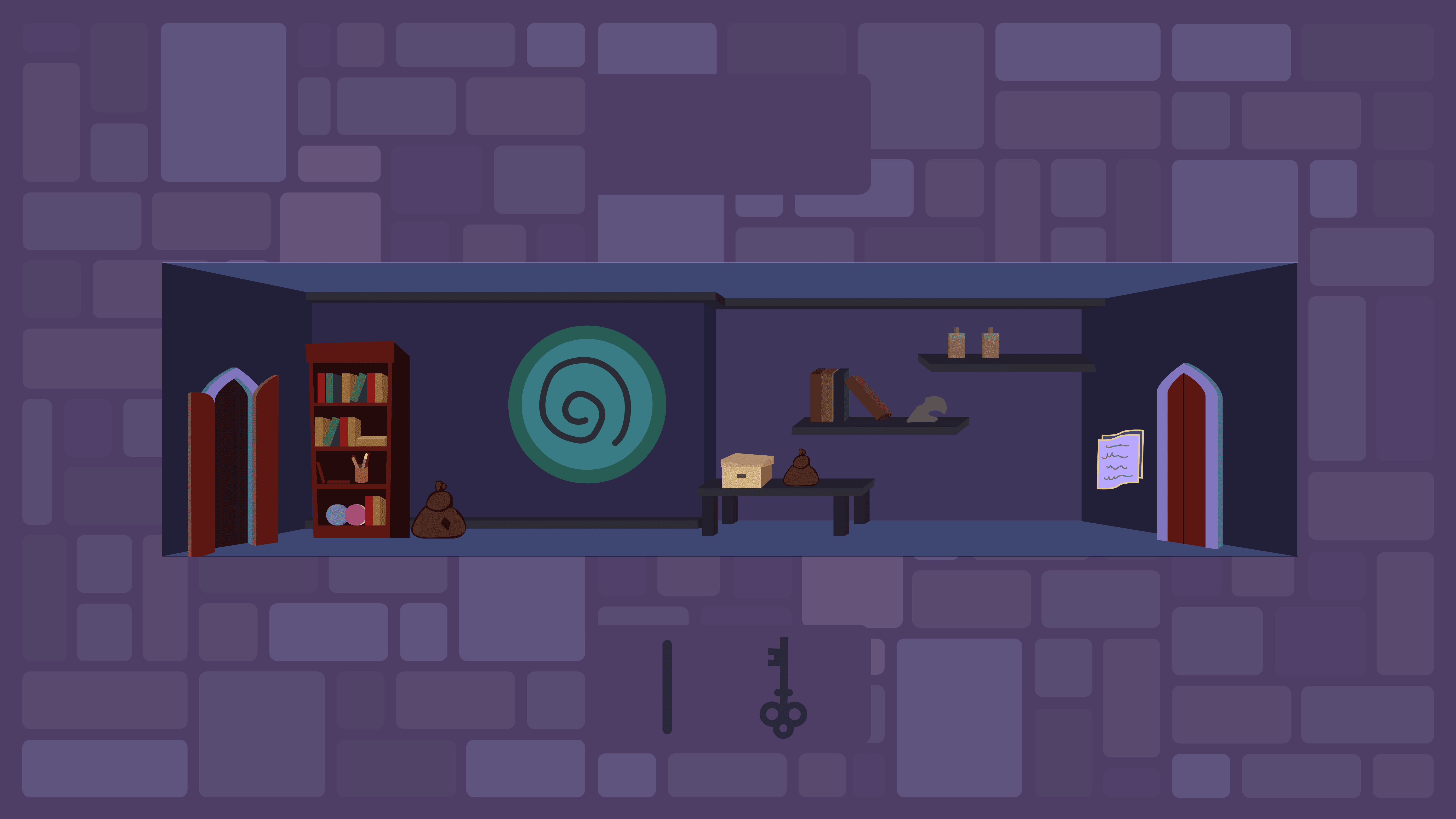
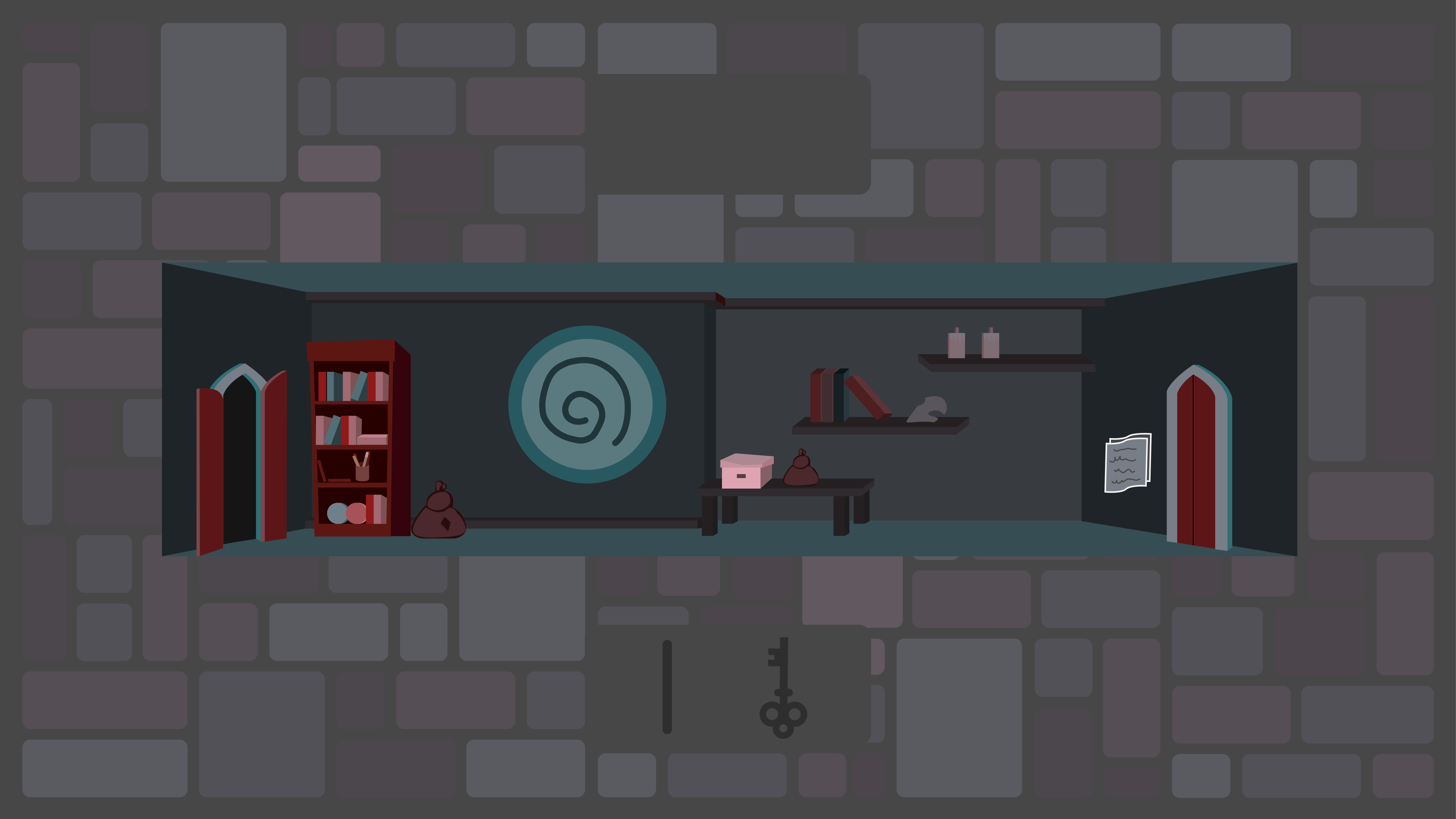
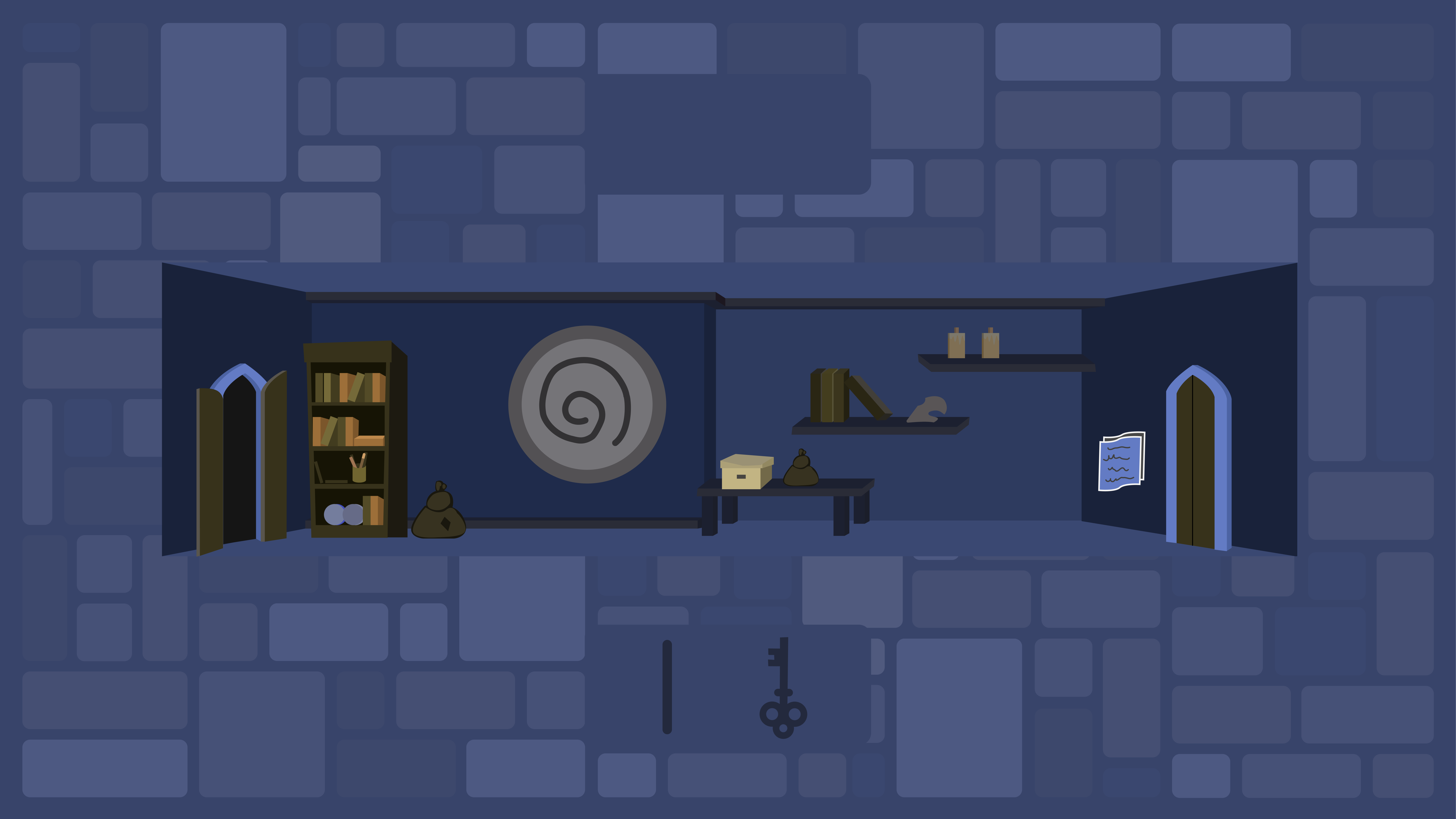
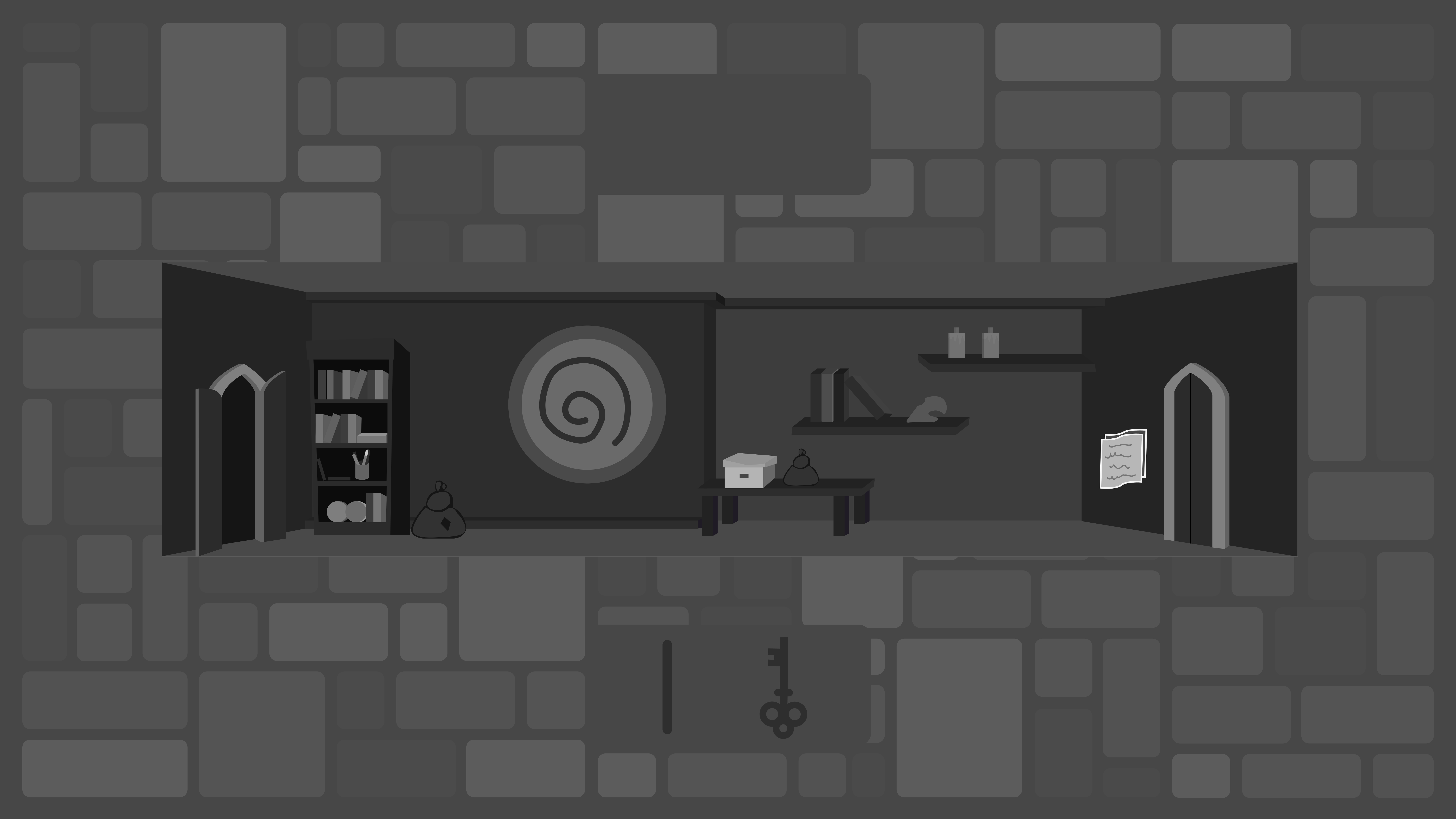
The game is grounded in versions of real forms of colour blindness, including protanopia, deuteranopia, and tritanopia.
This research informed the colour systems, contrast decisions, and puzzle construction.
Each player mode alters the full visual experience of the game, environments, characters, and puzzles, reinforcing the idea that individual perception shapes reality.
Intent
Make accessibility the core mechanic.
Instead of teaching colour blindness directly, the game asks players to operate within it. Each perspective reveals unique information. Success requires combining them.
This game reframes accessibility from accommodation to empowerment. Difference becomes advantage.
Story
Three of four friends have been captured by an evil sorcerer.
Players must traverse the sorcerer's tower, solving puzzles to rescue each friend and ultimately defeat the evil wizard.
Every rescued character brings a new way of seeing the world. What starts as a solo journey gradually becomes a collective effort, where progress depends on bringing everyone back together.
Assets
All visual assets were designed in-house, including characters, environments, UI elements, and animations.
This ensured consistency across color modes and allowed visual decisions to be made directly in service of gameplay — from character silhouettes to puzzle readability and interface hierarchy.
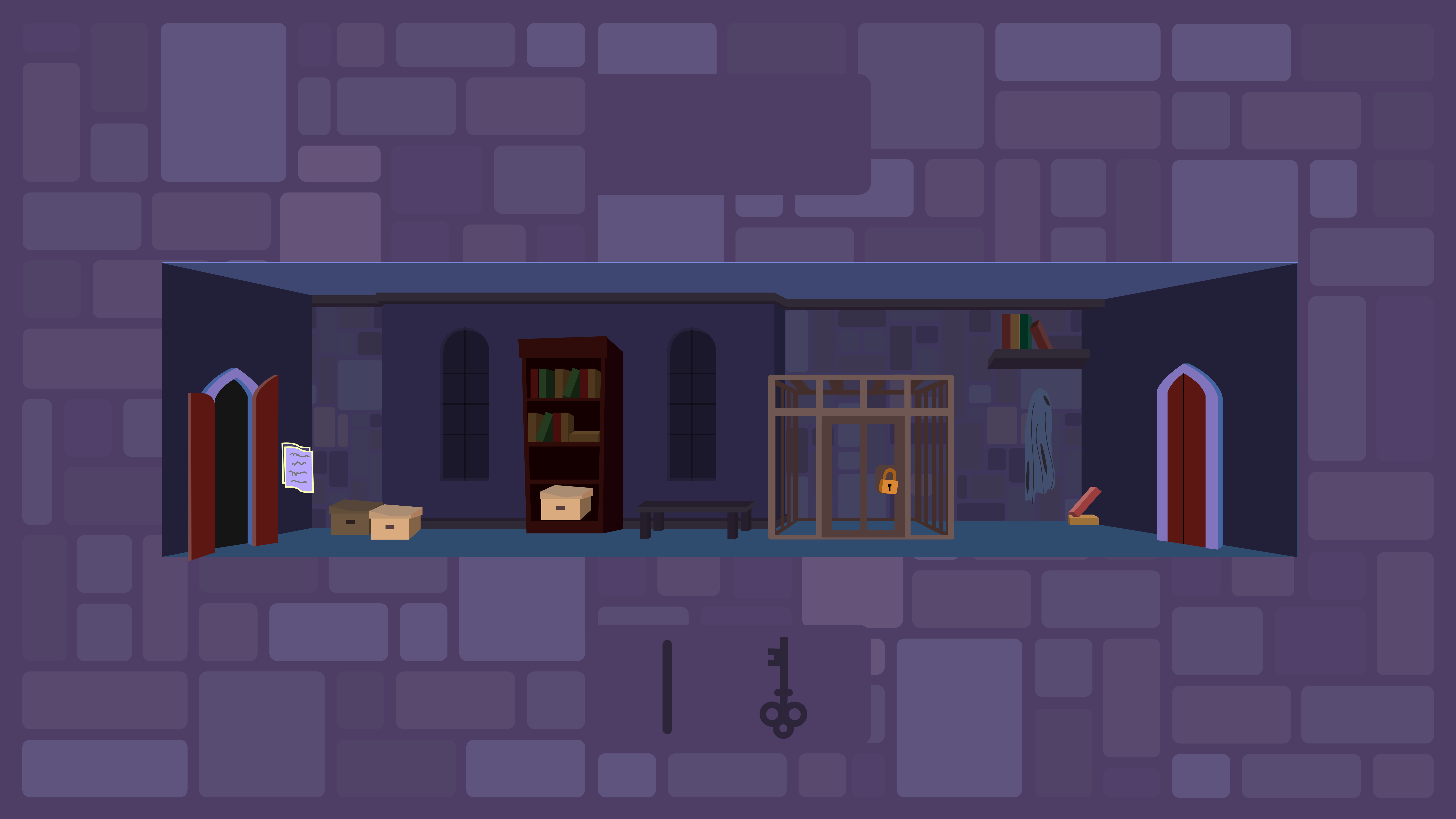
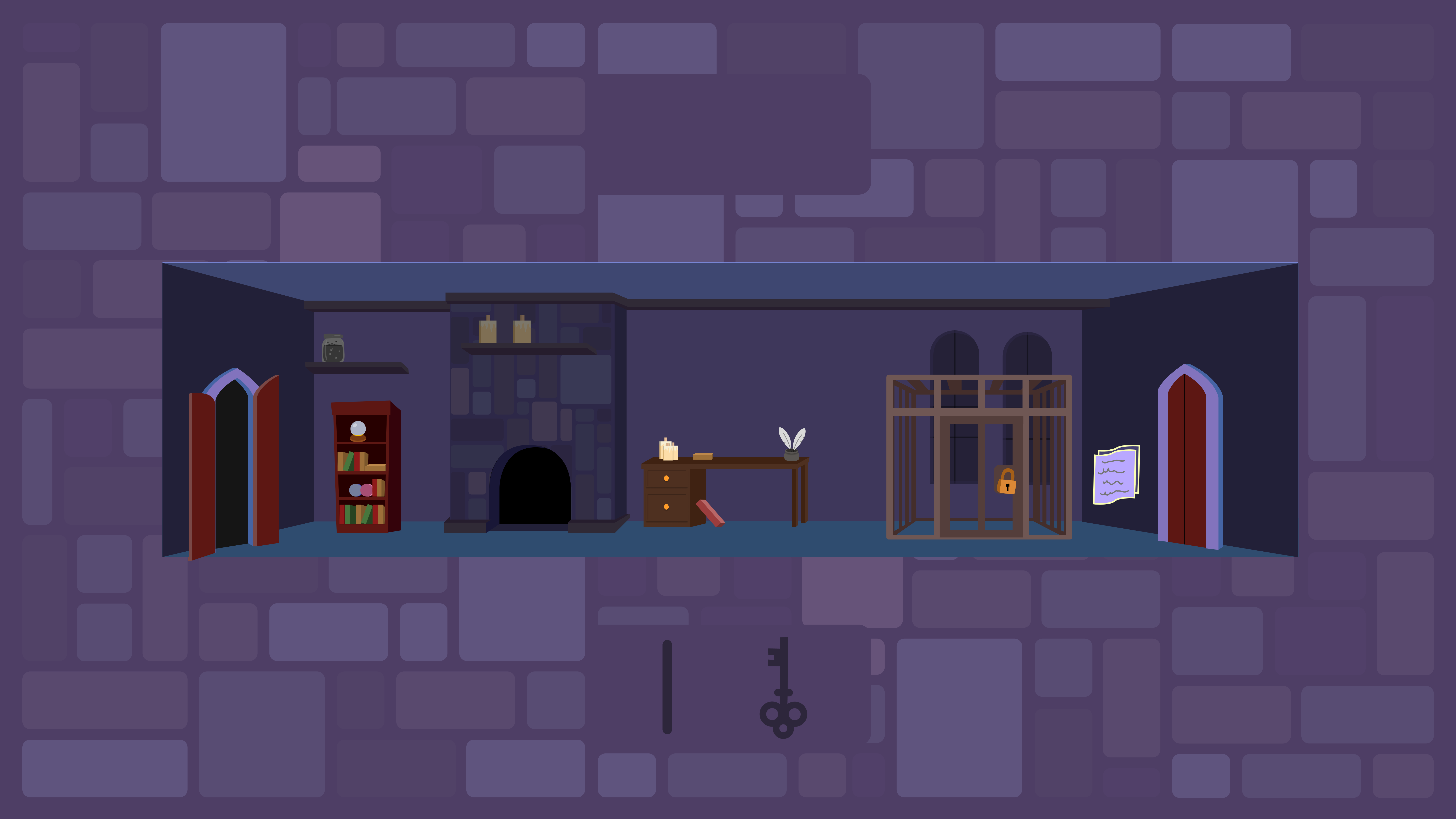

Mechanics
The player starts with one character and explores the tower by finding hidden objects, unlocking doors and cages, and solving word-based puzzles.
As friends are rescued, new colour perspectives are unlocked which can be toggled, changing the entire colour scheme of the game world.
No single unlocked perspective reveals a full puzzle solution. Difficulty increases through these interactions, while the core loop remains simple: explore, switch perception, solve, advance.
Feedback
Clear visual feedback guides players through the game.
When items are collected, wands and keys briefly float above the character before moving into the inventory. Cages visually transition from locked doors to open gates when unlocked. If a player attempts to open a spellbook without an equipped wand, a warning screen appears to prevent confusion and redirect them toward the correct action.
Each feedback moment is designed to be quick, readable, and consistent.

Process
Originally scoped as a group project, I ended up designing and building the entire game myself in p5.js.
Art, mechanics, and code evolved together. Every puzzle was iterated through real colour simulations, adjusting spacing, hue, and grouping until each view became necessary.
Lesson
Early on, I leaned heavily on vibe coding, using AI to move fast and prototype freely. This worked well, until it didn't.
As the game grew more complex, the lack of upfront structure caught up.
Because the project lived in a single, unorganized file, small changes began breaking unrelated parts of the game. Adding new features became fragile. Several planned elements, deeper puzzle logic, a proper instruction flow, richer feedback, and a fuller narrative ending, had to be scaled back.
The issue wasn’t AI itself. It was using AI in isolated moments without a human-designed structure overseeing the whole system.
The lesson was simple: speed without organization doesn’t scale. Good architecture isn’t just about clean code, but creative space/room for intention. Without it, complexity collapses possibility. With it, ideas can grow.

Outcome
Sorcerer’s Prism came together as a complete, playable prototype, bringing story, mechanics, art, and theory into a single experience.
The project was voted Best Game Design by my classmates, which meant a lot. Not just as recognition, but as confirmation that the idea connected with people the way I hoped it would.
More than a game, it became a small experiment in perspective, showing how interaction can communicate something deeper than words alone.
Reflection
This project reminded me that good design starts with empathy. With stepping outside of your own experience and building from someone else’s.
It also taught me something practical: ideas move fast, but systems need care. Rapid prototyping helped the game take shape quickly, but real progress only came once structure caught up with creativity. The way something is built directly shapes what it can become.
Sorcerer’s Prism changed how I think about making things. Design isn’t just how something looks or feels. It’s how everything connects. Story, mechanics, code, and emotion all live in the same system.